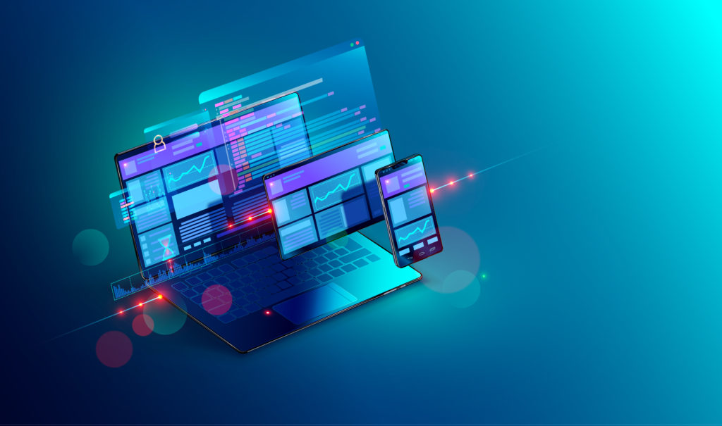
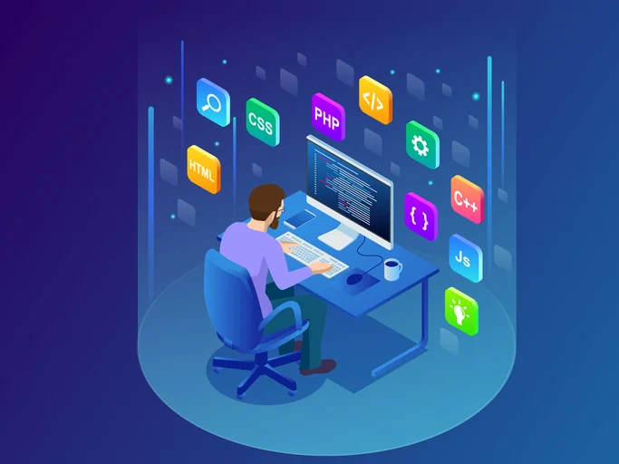
Experts say that today’s web design has reached a very high level. It combines seemingly incompatible directions. On the one hand, interfaces are becoming more and more unified and minimalistic. On the other hand, spectacular visual techniques and wow-design in general are actively used.

The desire for unification
The interface is becoming more and more “smart” and at the same time minimalistic. Its main task is to give the user exactly the content and functionality that is needed at the moment. For this reason, designers pay maximum attention to the organization of the structure and the arrangement of interface elements so as to obtain a functional, but not overloaded interface.
This trend arose due to the fact that users begin to perceive devices with a complex interface as an obstacle to solving the problem. Unification of interfaces allows the user to quickly adapt to new products, immediately use the maximum of their capabilities. This is also beneficial for developers, because they get the opportunity to quickly launch new solutions precisely due to their unification with already used products.
1. Block structure
Initially, web-design was built “according to the patterns” of printed documents. So, in the early years of the active development of the Internet, the pages of sites were designed with alternating texts and illustrations. In 2012, web designers began to use modular designs that combine both visualization and informative content. Such modules are most actively used to organize content viewed from mobile devices. The trend is gradually developing: already today, blocks that increase and decrease in size, the possibility of moving them, etc. are used.
2. Ghost buttons
This technique lies in the fact that the buttons on the site are translucent. They are noticeable, but do not attract too much attention. Such buttons are the “anthem” of unification: they organically fit into the design of any site.
3. Comfortable navigation
The navigation of modern websites is rapidly improving. The main trend is to imitate the structure and structure of the functional elements of solutions for mobile devices. Websites often use side menus that pop up on click or hover, as well as large touch-like buttons.
Actively used navigation in the process of scrolling. This technique consists in highlighting, highlighting or animating certain details that appear on the screen when scrolling. This selection allows you to focus on important points.
4. Comfortable registration
If earlier forms for registration on sites were very complex, now they contain a maximum of a couple of lines. Moreover, many resources offer the possibility of identification through social networks without registration at all.
Bright visualization in modern design
Web-designers use a number of modern techniques in order to interest the user in the content on the site, to attract his attention. Visually spectacular websites first began to appear in the late 2000s. Then this trend was quickly abandoned – the onset of the crisis required simpler solutions. However, today flashy visualization is making a comeback. Web products with wow design are created mainly by code in HTML5 and CSS3. The graphics remain simple, and the wow-effect arises through the use of truly original techniques.
1. Background as a source of atmosphere
Image photographs are often used as a background, which do not distract from the content superimposed on top and at the same time create a special atmosphere. Modern features allow you to make such photos interactive – they can be mobile, respond to scrolling or mouse movements.

2. Long shadows
A natural step in the development of flat design was the appearance of “long shadows”. Their use allows you to make objects three-dimensional, animate information.
3. Geometry in a new way
Traditionally, horizontal orientation is used in web design, but today it is far from the only option. Among the most relevant and interesting solutions are the diagonal arrangement of modules and blocks on the page, as well as the use of complex polygons.
Parallax
This technique has been used in web design for a long time, but today its application is becoming more and more creative. The bottom line is that objects and the background react to scrolling differently (for example, they scroll at different speeds).
Tell me a story
The design concept of Storytelling is based on intrigue, which forces the user to either scroll to the end of the page or take certain actions in order to find out the denouement. This intrigue is realized with the help of built-in objects, animation, and other tricks.
Creative approach
“Traps” for users, creative or funny details attract attention. Their use in web design is becoming more active – such elements are a full-fledged design detail.
Thus, a modern site should not only be very convenient or beautiful – functionality, “intellectuality”, minimalism and unification are important. At the same time, how effective and memorable the resource is also of great importance. The ideal design should be developed primarily with care for users and their interests, be such that the visitor does not want to leave the site.
